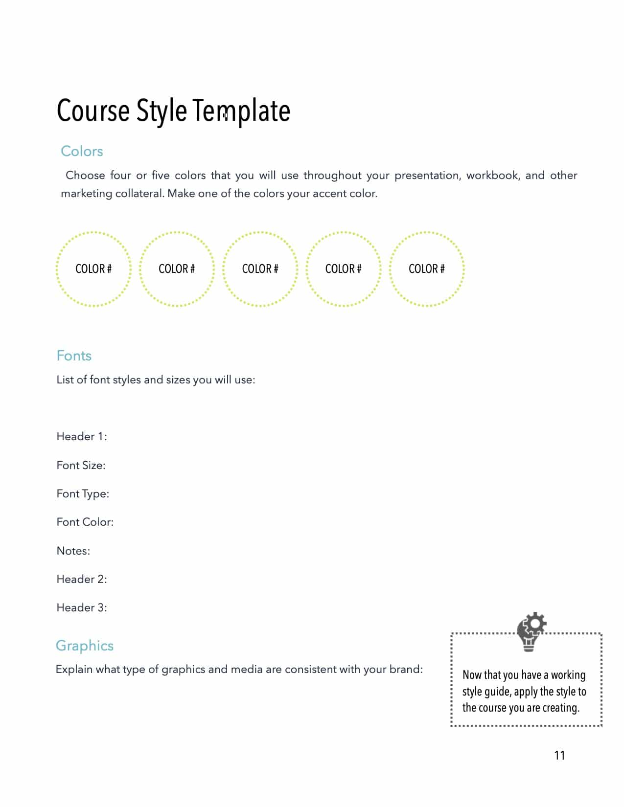
Consistent Look and Feel
All too often, people will dive into creating PowerPoints or online courses without first defining a style guide. As the project matures, you may find you have a jumble of colors, fonts, and graphics. You’ll see colors used in different sections to mean different things. You’ll see clip art combined with photos in many different styles, and texts of different sizes and fonts. The lack of consistency can be distracting to your audience; they might ask, “Why the change in font or size? Does it mean something? Should I be grasping something of importance?” Such a course or presentation also lacks the professionalism you desire.


